widgets
There are 3 main types of widgets: live-bar, header and menus.
| Key | Value Type | Description |
|---|---|---|
| enabled | Boolean | Indicates whether a particular type of widget is enabled for the livepage. |
| features | Array of objects | Each type of widget has multiple features. For example, live-bar widget has 7 different features whereas a header widget has only 3 features. |
| featuresOrdering | Boolean | Indicates if the list of features are being ordered in the array. |
| inputs | Array of objects | |
| options | Array | |
| position | String | Field is only available when widget is of type: “live-bar”. Position can be “right” or “left”, etc. |
| widget | String | There are 3 types of widgets: “live-bar”, “header”, and “menus”. |
Types of features in widgets
widgets.features has type of array with different number of elements and each element have different attributes which varies according to the type of widget (live-bar, header or menus). Hence, we will categorize and show the attributes based on the widget type.
Live-bar
Structure of live-bar widget
widgets: Array(3)
  0:
    enabled: true
    features: (7) [{…}, {…}, {…}, {…}, {…}, {…}, {…}]
    featuresOrdering: true
    inputs: (5) [{…}, {…}, {…}, {…}, {…}]
    options: []
    position: "right"
    widget: "live-bar"
Feature of live-bar widget
For live-bar widget, there are a total of 7 features. You may refer to the overall features structure below.
features: Array(7)
0: {enabled: true, name: "Attendee Profile", feature: "attendeeprofile", order: 1, options: "", inputs: []}
1: {enabled: true, name: "Notifications", feature: "notifications", order: 2, options: "", inputs: []}
2: {enabled: true, name: "Chat", feature: "chat", order: 3, options: "", inputs: []}
3: {enabled: true, name: "Participants", feature: "participants", order: 4, options: "", inputs: []}
4: {enabled: true, name: "Schedule", feature: "agenda", order: 5, options: "", inputs: []}
5: {enabled: false, name: "For You", feature: "foryou", order: 6, options: "", inputs: []}
6: {enabled: true, name: "Your Messages", feature: "directmessage", order: 7, options: "", inputs: []}
The 7 features that we currently support are:
- Attendee profile
- Notifications
- Chat
- Participants
- Schedule (agenda)
- Your Messages (direct message)
Each feature has a unique inputs attributes.
For Attendee profile, the inputs are shown here:
inputs: Array(5)
0: {value: "Attendee Profile", field: "name", description: "Name for dom element", type: "string", required: true}
1: {value: "Attendee Profile", field: "title", description: "Title of the drawer once open", type: "string", required: true}
2: {value: "Attendee Profile", field: "label", description: "Label of the icon button", type: "string", required: true}
3: {value: "300px", field: "width", description: "Width of the drawer once opened", type: "string", required: true}
4: {field: "enableLogout", value: true, type: "boolean", required: false, description: "Toggle logout icon", …}
Attendee Profile has 5 different objects, in which element 0-3 is to describe the name, title and label for the attendee profile, whereas element 3 is reponsible for the width of the drawer panel.
enableLogout inputs is expanded further below:
inputs: Array(1)
0:
  description: "Label of the icon button"
  field: "enableConfirmation"
  inputs: Array(2)
    0: {value: "Sign Out", field: "logoutText", description: "Label of the icon button", type: "string", required: false}
    1: {value: "Are you sure you want to log out?", field: "dialogueText", description: "Label of the icon button", type: "string", required: false}
  required: false
  type: "boolean"
  value: false
For Notifications, the inputs are shown here:
inputs: Array(3)
  0: {value: "Notifications", field: "name", description: "Name a notification for dom element", type: "string", required: true}
  1: {value: "Title", field: "title", description: "Title of the notification drawer once open", type: "string", required: true}
  2: {value: "Notifications", field: "label", description: "Label of the icon button", type: "string", required: true}
For Chat, the inputs are shown here:
inputs: Array(4)
  0: {value: "Chat", field: "name", description: "Name a chat for dom element", type: "string", required: true}
  1: {value: "Stream Chat", field: "title", description: "Title of the chat drawer once open", type: "string", required: true}
  2: {value: "Stream Chat", field: "label", description: "Label of the icon button", type: "string", required: true}
  3: {value: "300px", field: "width", description: "Width of the drawer once opened", type: "string", required: true}
For Chat, the inputs are shown here:
inputs: Array(9)
  0: {value: "Participants", field: "name", description: "Name for the participants list in chat", type: "string", required: true}
  1: {value: "Participants", field: "title", description: "Title for the participants list in chat", type: "string", required: true}
  2: {value: "Participants", field: "label", description: "Label of the icon button", type: "string", required: true}
  3: {value: "", field: "filter", label: "Filter", description: "Filter out user(s) to display on the participant list", type: "label", options: "", inputs: []}
  4: {value: false, field: "showOffline", description: "Allow displaying offline users. Filter needs to be populated in order to work, otherwise it'll display user that's online by default", type: "boolean", required: false}
  5: {value: "300px", field: "width", description: "Width of the drawer once opened", type: "string", required: true}
  6: {value: true, field: "enableBookmark", description: "Ability to bookmark a user", type: "boolean", required: false, inputs: null}
  7: {field: "profile", value: true, type: "boolean", required: false, description: "Show/hide profile details", options: "", inputs: []}
  8: {value: false, field: "showParticipantsCount", description: "Show/hide the count of participant(s) in chat", type: "boolean", required: false}
For Participants, the inputs are shown here:
inputs: Array(9)
  0: {value: "Participants", field: "name", description: "Name for the participants list in chat", type: "string", required: true}
  1: {value: "Participants", field: "title", description: "Title for the participants list in chat", type: "string", required: true}
  2: {value: "Participants", field: "label", description: "Label of the icon button", type: "string", required: true}
  3: {value: "", field: "filter", label: "Filter", description: "Filter out user(s) to display on the participant list", type: "label", options: "", inputs: []}
  4: {value: false, field: "showOffline", description: "Allow displaying offline users. Filter needs to be populated in order to work, otherwise it'll display user that's online by default", type: "boolean", required: false}
  5: {value: "300px", field: "width", description: "Width of the drawer once opened", type: "string", required: true}
  6: {value: true, field: "enableBookmark", description: "Ability to bookmark a user", type: "boolean", required: false, inputs: null}
  7: {field: "profile", value: true, type: "boolean", required: false, description: "Show/hide profile details", inputs: []}
  8: {value: false, field: "showParticipantsCount", description: "Show/hide the count of participant(s) in chat", type: "boolean", required: false}
Filter inputs is expanded further below:
inputs: Array(3)
  0: {value: "", field: "field", description: "Field that is pertaining to the column saved from the people database", type: "string", required: false}
  1: {value: "", options: ["include", "notInclude"], field: "operator", description: "List of condition supported on the database", type: "string", required: false}
  2: {value: "", field: "value", description: "Value of the selected field. Use comma separated values for multiple entry", type: "string", required: false}
Profile inputs is expanded further below:
inputs: Array(2)
  0: {value: true, field: "details", description: "Show/hide details of user", type: "boolean", required: false}
  1: {value: true, field: "enableBookmark", description: "Show/hide bookmark option", type: "boolean", required: false}
For Schedule, the inputs are shown here:
inputs: Array(6)
  0: {value: "Your Schedule", field: "name", description: "Name for dom element", type: "string", required: true}
  1: {value: "Your Schedule", field: "title", description: "Title of the drawer once open", type: "string", required: true}
  2: {value: "Your Schedule", field: "label", description: "Label of the icon button", type: "string", required: true}
  3: {value: "300px", field: "width", description: "Width of the drawer once opened", type: "string", required: true}
  4: {field: "buttons", label: "Buttons", value: null, type: "label", description: "Enable to edit text for below buttons", options: "", inputs: []}
  5: {field: "display", value: null, type: "label", label: "Display", required: false, options: "", description: "Enable to hide/show below details", inputs: []}
Buttons inputs is expanded further below:
inputs: Array(2)
  0: {value: "Attend", field: "agenda", description: "Display the text of a button", type: "string", required: false}
  1: {value: "Join", field: "meeting", description: "Display the text of a button", type: "string", required: false}
Display inputs is expanded further below:
inputs: Array(4)
  0: {value: true, field: "time", description: "Display the time of agenda created", type: "boolean", required: false}
  1: {value: true, field: "title", description: "Display the title of agenda created", type: "boolean", required: false}
  2: {value: true, field: "speakers", description: "Display the speakers of agenda created", type: "boolean", required: false}
  3: {value: true, field: "description", description: "Display the description of agenda created", type: "boolean", required: false}
For Direct Message, the inputs are shown here:
inputs: Array(6)
  0: {value: "Your Messages", field: "name", description: "Name for dom element", type: "string", required: true}
  1: {value: "Your Messages", field: "title", description: "Title of the drawer once open", type: "string", required: true}
  2: {value: "Your Messages", field: "label", description: "Label of the icon button", type: "string", required: true}
  3: {value: "300px", field: "width", description: "Width of the drawer once opened", type: "string", required: true}
  4: {field: "enableVideoChat", value: true, type: "boolean", required: false, description: "Enable/disable setting video chat", options: "", inputs: []}
  5: {field: "enableScheduleChat", value: true, type: "boolean", required: false, description: "Enable/disable setting scheduled video-chat", options: "", inputs: []}
enableVideoChat inputs is expanded further below:
inputs: Array(1)
  0:
    description: "Allowing setting video chat only on certain users"
    field: "allow"
    inputs: (3) [{…}, {…}, {…}]
    label: "Allow"
    options: ""
    required: false
    type: "label"
    value: null
This inner inputs of enableVideoChat have the following properties:
inputs: Array(3)
  0: {value: "", field: "field", description: "Field that is pertaining to the column saved from the people database", type: "string", required: false}
  1: {value: "", options: Array(4), field: "operator", description: "List of condition supported on the database", type: "string", options: ["===", "!==", "==", "!="], required: false}
  2: {value: "", field: "value", description: "Value of the selected field. Use comma separated values for multiple entry", type: "string", required: false}
enableScheduleChat inputs is expanded further below:
inputs: Array(1)
  0:
    description: "Allowing setting scheduled video-chat only on certain users"
    field: "allow"
    inputs: (3) [{…}, {…}, {…}]
    label: "Allow"
    options: ""
    required: false
    type: "label"
    value: null
This inner inputs of enableScheduleChat have the following properties:
inputs: Array(3)
  0: {value: "", field: "field", description: "Field that is pertaining to the column saved from the people database", type: "string", required: false}
  1: {value: "", options: Array(4), field: "operator", description: "List of condition supported on the database", type: "string", options: ["===", "!==", "==", "!="], required: false}
  2: {value: "", field: "value", description: "Value of the selected field. Use comma separated values for multiple entry", type: "string", required: false}
Inputs of live-bar widgets
inputs: Array(5)
  0: {name: "Position", field: "position", description: "Position where to pop-up the drawer once open", type: "string", value: "right", options: ["left", "right"], required: true}
  1: {name: "Open By Default", field: "openByDefault", description: "Select what feature to be open by default once liv…s loaded. Name of the feature is the valid value.", value: "", options: ["", "chat", "participants", "directmessage", "attendeeprofile", "agenda"], required: false}
  2: {name: "Closable", field: "closable", description: "Set drawer closable to true or false", value: true, type: "boolean", required: false}
  3: {name: "Mode", field: "mode", description: "Theme for live-bar", type: "string", value: "light", options: ["light", "dark"], required: true}
  4: {name: "Push LivePage content", field: "push_live_page_content", description: "Turning this setting on will push the content of the LivePage when the LiveBar panel is open. If this setting is turned off, the LiveBar panel will overlap the content of the LivePage."
Header
Header has a simpler body content as compared to live-bar, as it only has 3 features (logo, title and menu) and there is no inputs and options.
Structure of header widget
widgets: Array(3)
  1:
    enabled: true
    features: (3) [{…}, {…}, {…}]
    featuresOrdering: null
    inputs: []
    options: []
    widget: "header"
Features of header widget
For header widget, there are a total of 3 features. You may refer to the overall features structure below.
features: Array(3)
  0: {enabled: true, name: "Logo", feature: "logo", type: "option", value: "default", , inputs: "", options: []}
  1: {enabled: true, name: "Title", feature: "title", type: "option", value: "default", inputs: "", options: []}
  2: // Refer to Menus section
The 7 features that we currently support are:
- Logo
- Title
- Menu
Each feature has a unique inputs attributes.
For logo, the values that need to be selected is either the default logo or a custom image. We will use the image below as reference:
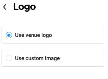
If a default logo is used, the object structure will look something like this:
features: Array(3)
0:
  enabled: true
  feature: "logo"
  name: "Logo"
  options: Array(2)
    0: {label: "Use venue logo", selected: true, value: "https://files-dev-myxp.s3-ap-southeast-1.amazonaws…1/607ebe84201b1d00c3f09095/thyaN/3lubq88a4ckl.png", type: "option"}
    1: {label: "Use custom image", selected: false, value: ...}
  type: "option"
  value: "default" // value will be default here
If a custom logo is used, the object structure will look something like this:
features: Array(3)
0:
  enabled: true
  feature: "logo"
  name: "Logo"
  options: Array(2)
  0: {label: "Use venue logo", selected: false, value: "default", type: "option"}
  1:
    [{label: "image", field: "image", value: "https://files-dev-myxp.gevme.com/Ak8FNuPygYV6X4QpuY21/607ebe84201b1d00c3f09095/CbuCy/capture.jpg", type: "image", required: true}]
    label: "Use custom image"
    selected: true
    type: "option"
    value: "https://files-dev-myxp.gevme.com/Ak8FNuPygYV6X4QpuY21/607ebe84201b1d00c3f09095/CbuCy/capture.jpg"
  type: "option"
  value: "https://files-dev-myxp.gevme.com/Ak8FNuPygYV6X4QpuY21/607ebe84201b1d00c3f09095/CbuCy/capture.jpg"
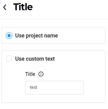
For Title, the values that need to be selected is either the default project title or a custom title. We will use the image below as reference:
If a default title is used, the object structure will look something like this:
features: Array(3)
  1:
    enabled: true
    feature: "title"
    name: "Title"
    options: Array(2)
      0: {label: "Use project name", selected: true, value: "Test Genesis 3", type: "string"}
      1: {label: "Use custom text", selected: false, value: "test", type: "string", options: "", …}
    type: "option"
    value: "default"
If a custom title is used, the object structure will look something like this:
features: Array(3)
1:
  enabled: true
  feature: "title"
  name: "Title"
  options: Array(2)
  0: {label: "Use project name", selected: false, value: "default", type: "string"}
  1:
    inputs: [{label: "Title", value: "test", description: "Custom title", type: "string", required: true}]
    label: "Use custom text"
    options: ""
    selected: true
    type: "string"
    value: "test"
  type: "option"
  value: "test"
Menus
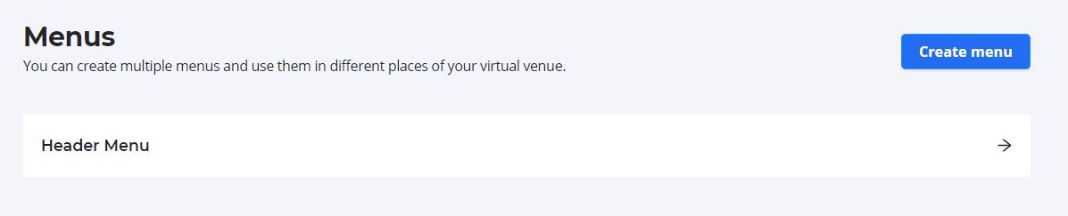
Menus is a subset of Header widget, and it is also a separate widget by itself.
Structure of menus widget
widgets: Array(3)
  2:
    enabled: true
    features: [{...}]
    featuresOrdering: false
    inputs: []
    options: []
    widget: "menus"
Input and options is always an empty array for menus widget. For features, it is an array of objects and each object contains id, name and menuItems. You can refer to the structure below:
Referring to the above menu, the features structure would like this:
features: Array(1)
  0: {id: "e9e41c70-a364-11eb-8d31-c3268e1c1f9d", name: "Header Menu", menuItems: Array(6)}
The menu items would depend on individual components within a menu. We will the following example in our illustration.
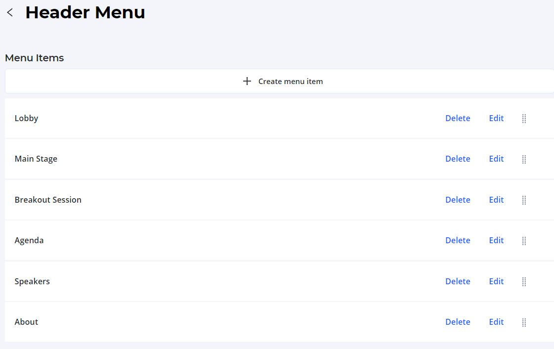
menuItems: Array(6)
  0: {id: "e9e52de0-a364-11eb-8d31-c3268e1c1f9d", name: "Lobby", link: "https://showcase-dev.gevme.com/page/test-genesis-3-lobby-197Si", openInNewWindow: true, order: 1, …}
  1: {id: "e9e52de1-a364-11eb-8d31-c3268e1c1f9d", name: "Main Stage", link: "https://showcase-dev.gevme.com/page/test-genesis-3-main-stage-ax14n", openInNewWindow: true, order: 2, …}
  2: {id: "e9e52de2-a364-11eb-8d31-c3268e1c1f9d", name: "Breakout Session", link: "https://showcase-dev.gevme.com/page/test-genesis-3-breakout-bMbeV", openInNewWindow: true, order: 3, …}
  3: {id: "e9e554f0-a364-11eb-8d31-c3268e1c1f9d", name: "Agenda", link: "https://showcase-dev.gevme.com/page/test-genesis-3-agenda-H1oM2", openInNewWindow: true, order: 4, …}
  4: {id: "e9e554f1-a364-11eb-8d31-c3268e1c1f9d", name: "Speakers", link: "https://showcase-dev.gevme.com/page/test-genesis-3-speakers-q0HPZ", openInNewWindow: true, order: 5, …}
  5: {id: "e9e554f2-a364-11eb-8d31-c3268e1c1f9d", name: "About", link: "https://showcase-dev.gevme.com/page/test-genesis-3-about-0Phs9", openInNewWindow: true, order: 6, …}
We will use Lobby menuItem to show the full structure of the object.
0:
  active: false
  id: "e9e52de0-a364-11eb-8d31-c3268e1c1f9d"
  link: "https://showcase-dev.gevme.com/page/test-genesis-3-lobby-197Si"
  menuItems: []
  name: "Lobby"
  openInNewWindow: true
  order: 1
  parentId: null
  preview: "test-genesis-3-lobby-197Si"
  showcaseId: null